DISPLAY · Lora
Aa Bb Cc
BODY · Karla
The body face carries the bulk of the page — product copy, PDP descriptions, blog posts. Set at 14–17px throughout.
Stoneware from Bizen, fired in oak.
Each installed style includes its own fonts, colors and starting layouts. Style accents changes color, shape and interface details while preserving your fonts, layouts and content.
The body face carries the bulk of the page — product copy, PDP descriptions, blog posts. Set at 14–17px throughout.
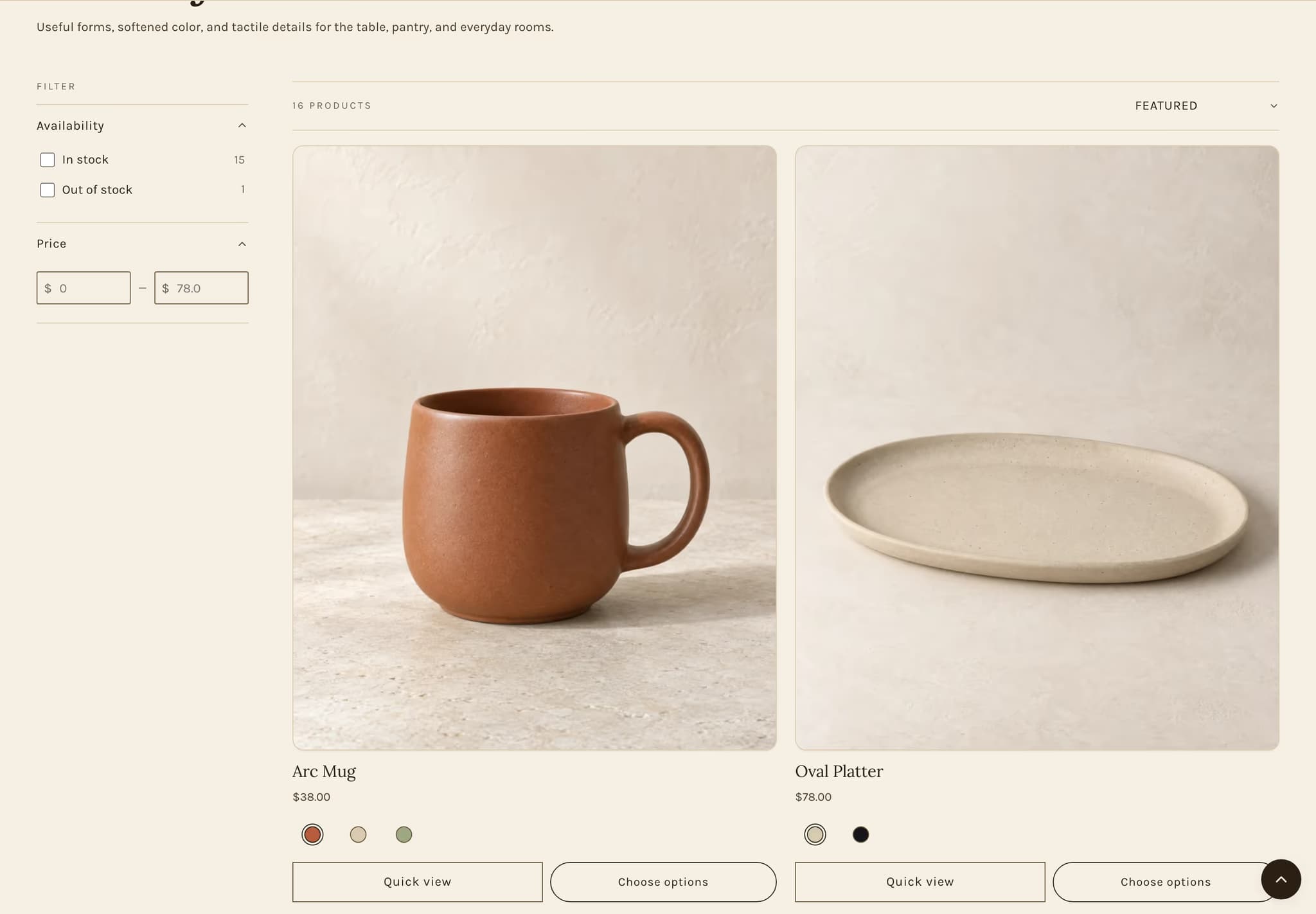
Pill buttons read soft and editorial. The default Mercer signature.
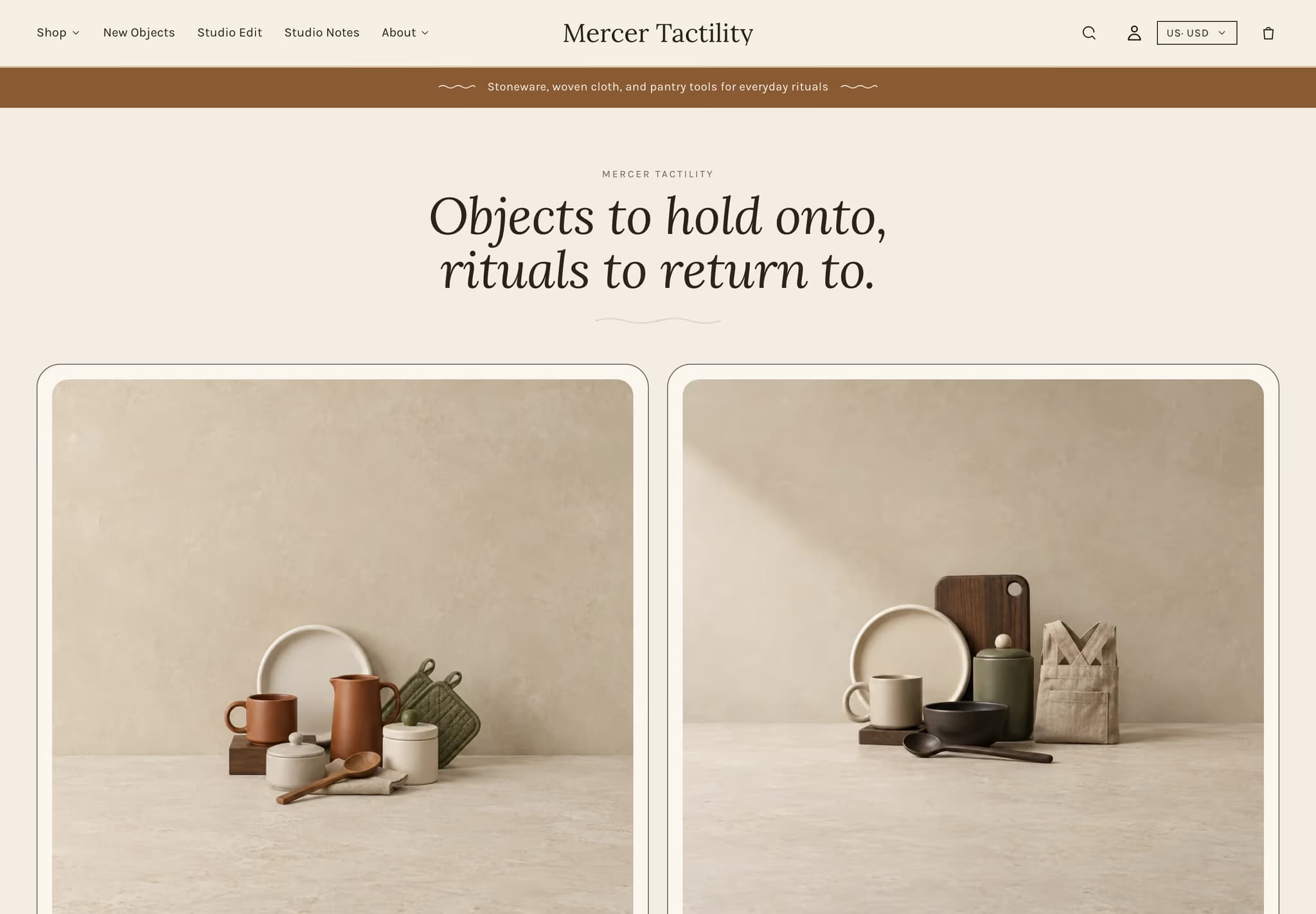
Ceramicists, pantry brands, and slow-goods merchants who care about provenance. Cream paper, walnut ink, a hand-fired terracotta accent. Lora display picks up where Fraunces signs off — warmer, less surgical. Built for stores where each SKU has a backstory.
A rounded collection-card grid topped by a toggleable announcement bar and a centered italic display heading with a drawn divider. Each card carries an image, title, count, and link on a generous off-white surface. The whole preset slows the page down on purpose.
Choose Tactility if your product has a maker's name attached. Pantry, ceramics, leather, oils, anything fired or finished by hand. Mercer feels too sharp here; Confetti is too loud. Tactility sits between and lets the goods do the work.
Currently viewing: Tactility. See all five →