DISPLAY · Fraunces
Aa Bb Cc
BODY · Inter
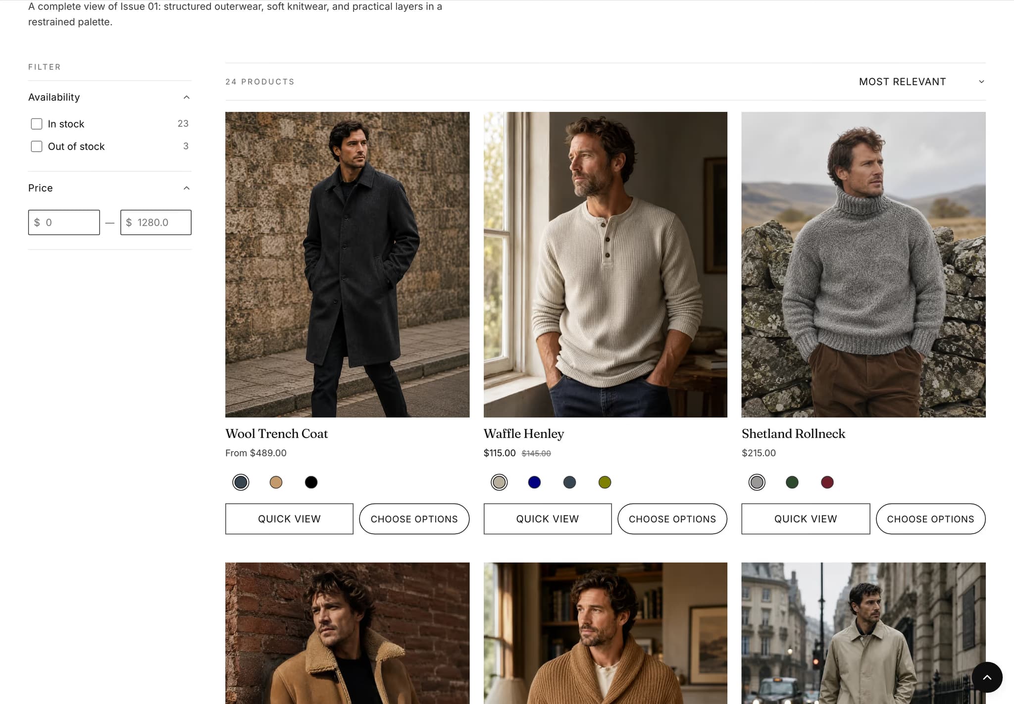
The body face carries the bulk of the page — product copy, PDP descriptions, blog posts. Set at 14–17px throughout.
Spring 25 edit. 84 looks, three silhouettes.
Each installed style includes its own fonts, colors and starting layouts. Style accents changes color, shape and interface details while preserving your fonts, layouts and content.
The body face carries the bulk of the page — product copy, PDP descriptions, blog posts. Set at 14–17px throughout.
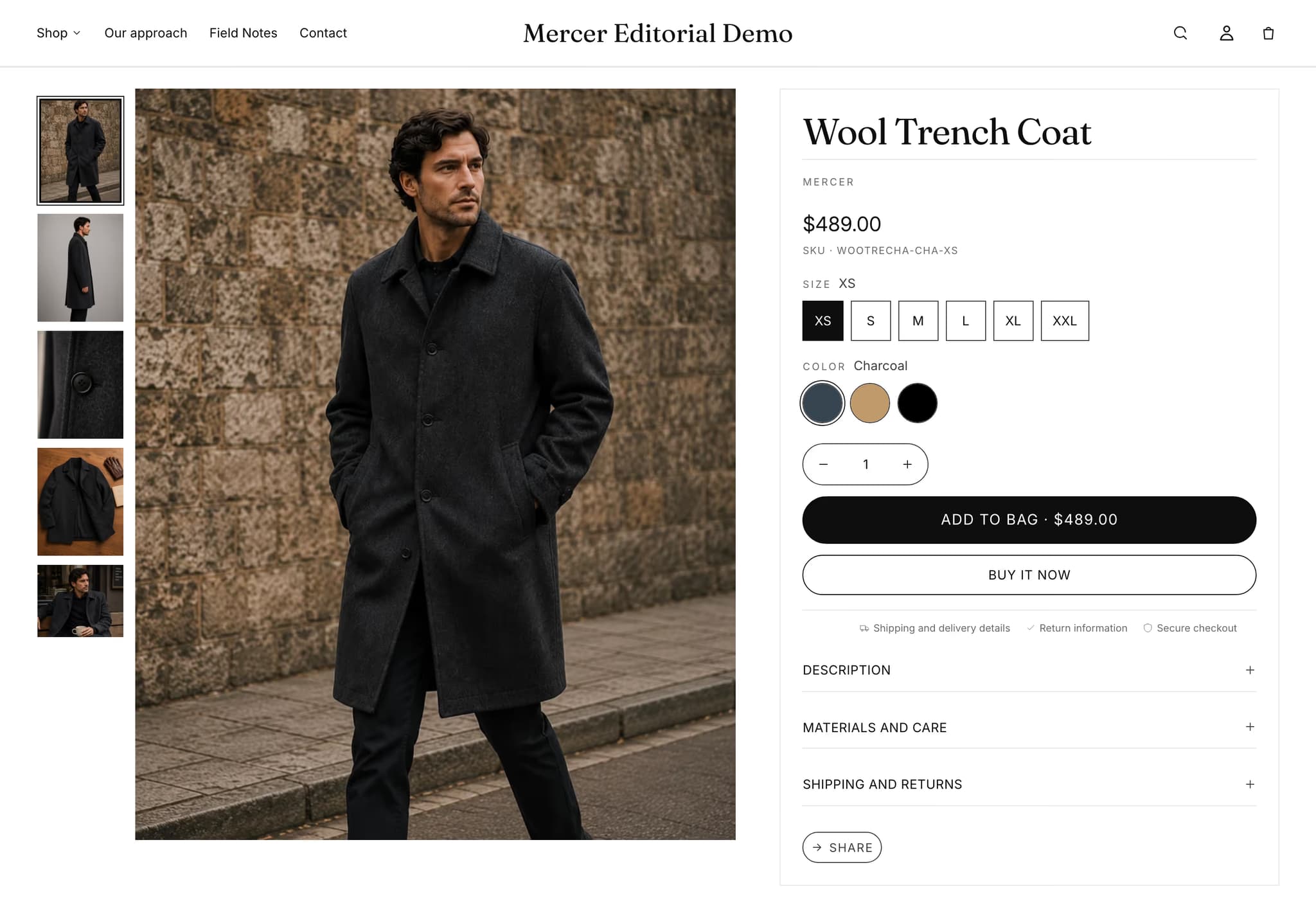
Pill buttons read soft and editorial. The default Mercer signature.
Fashion editors, beauty merchants, and lifestyle brands who want a storefront that reads like a magazine. Mercer is the system's default — black ink on white, a Fraunces display masthead, pill buttons, ample air. It assumes you ship in seasonal drops and shoot the goods in a studio.
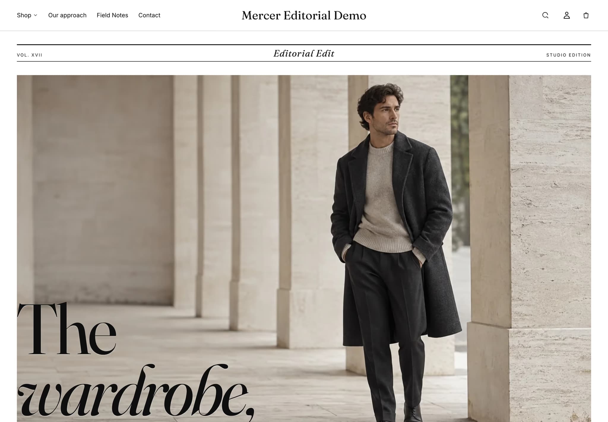
An editorial magazine-cover hero with a labelled masthead row, italic display second-lines as a typographic gesture, and an optional numbered in-this-issue index strip (off by default; turn it on and add Index item blocks). The pill button radius and the Fraunces / Inter pair are what make Mercer feel like a newsstand, not a checkout.
Choose Mercer if your brand reads as a publication first and a shop second. If you ship issues rather than products, this is the default. If you'd describe your aesthetic as craft, pop, or atelier, the other presets express those better.
Currently viewing: Mercer. See all five →