DISPLAY · Archivo
Aa Bb Cc
BODY · DM Sans
The body face carries the bulk of the page — product copy, PDP descriptions, blog posts. Set at 14–17px throughout.
Drop 04. SPF 50, tinted, refillable.
Each installed style includes its own fonts, colors and starting layouts. Style accents changes color, shape and interface details while preserving your fonts, layouts and content.
The body face carries the bulk of the page — product copy, PDP descriptions, blog posts. Set at 14–17px throughout.
Pill buttons read soft and editorial. The default Mercer signature.
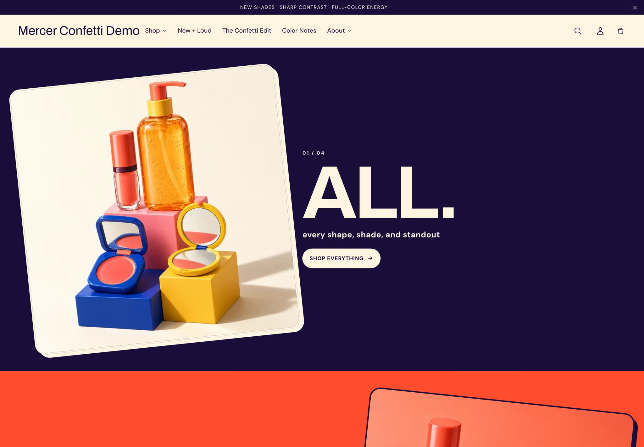
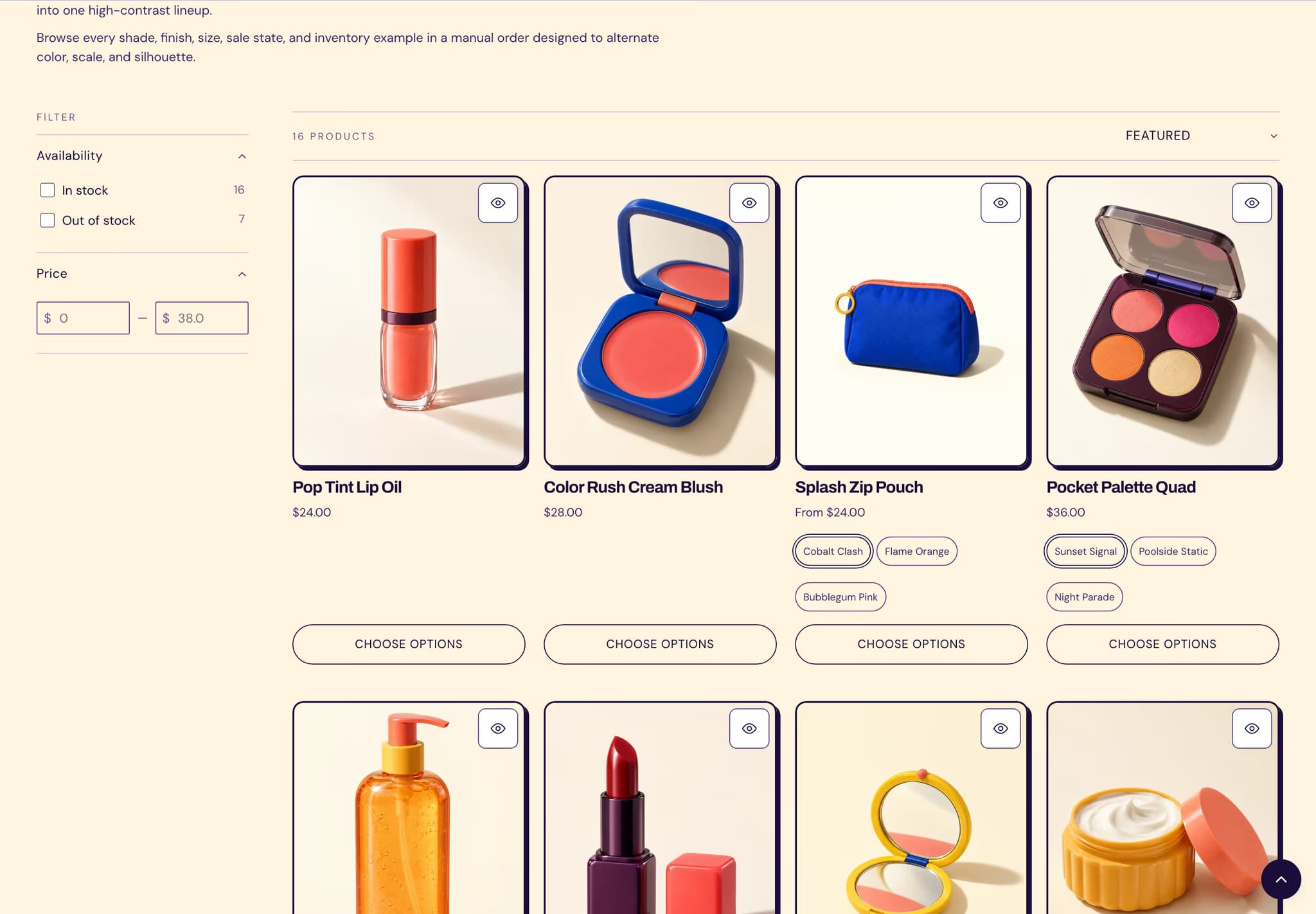
DTC beauty brands shipping in drops. Cream-yellow ground, ink-purple type, an orange-red accent that does not apologize. Archivo 700 for the display with slight letter-tightening — a billboard, not a magazine. Built for stores whose Instagram is louder than their About page.
A pop color-block hero with per-block fg / bg tokens (live on the block itself, not theme-wide), a slight rotation amount, and a Product scroller that shows products from a chosen collection. Pill buttons stay, but the type drops the air.
Choose Confetti if your product is a routine, a drop, or a refill. Mercer reads too restrained; Poise is the wrong vocabulary. If your launch calendar matters more than your founding story, Confetti is built for it.
Currently viewing: Confetti. See all five →